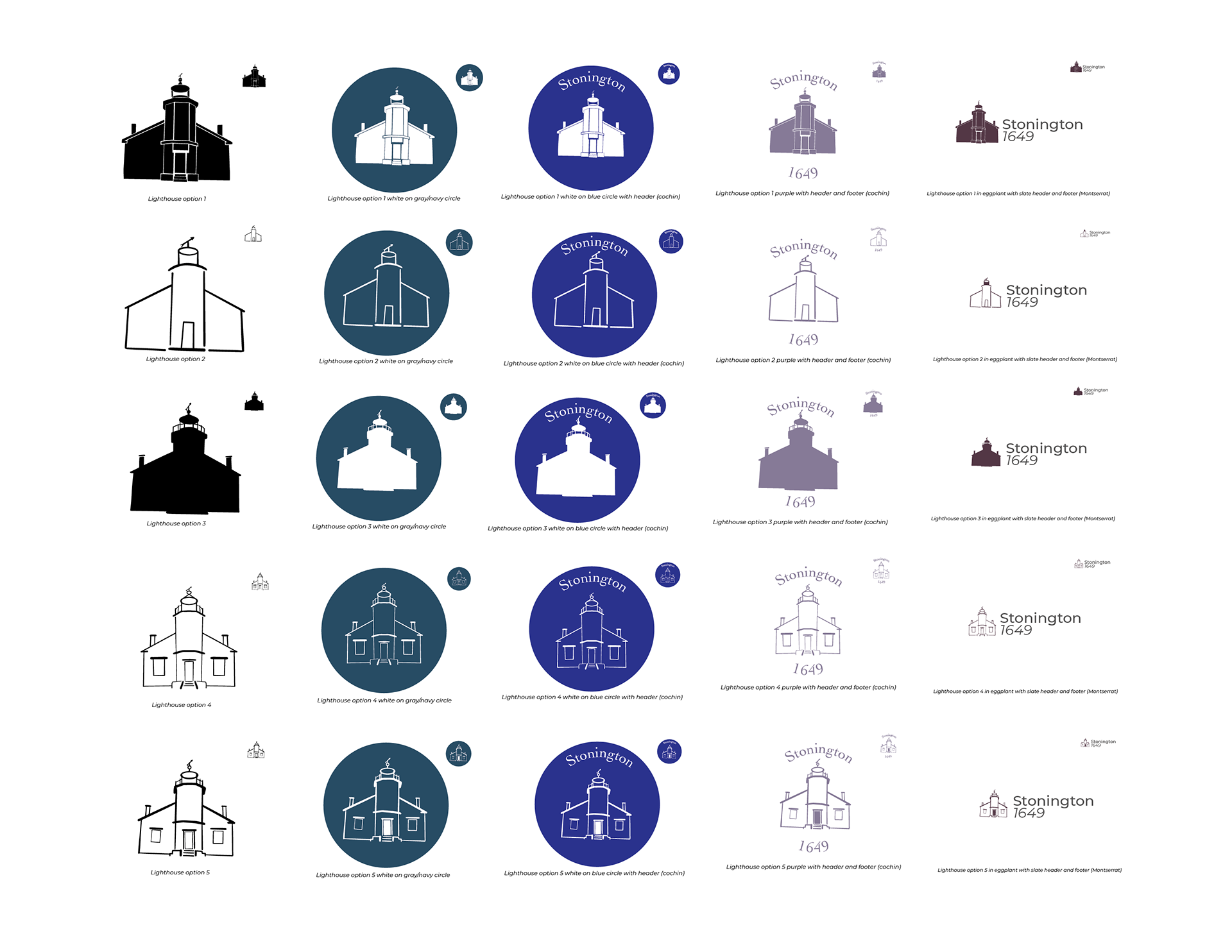
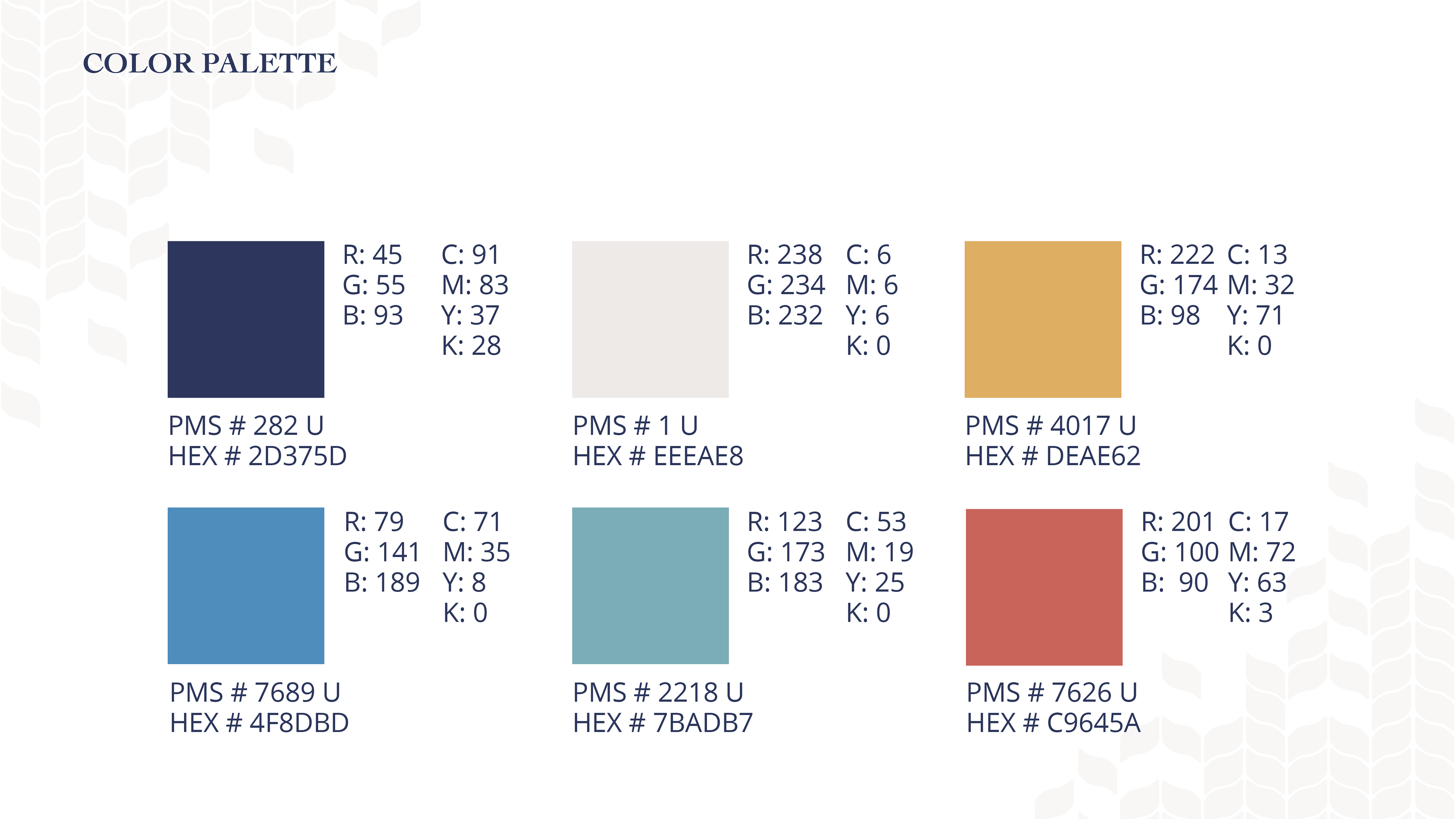
The objective of this rebrand is to give Stonington, CT a “facelift” without losing its nautical and colonial spirit that makes the town unique. This is achieved by creating a simplified icon that can be used as a fresh alternative to the traditional town crest, as well as integrating a color palette that is broader and more versatile than the vivid, primary blue and yellow currently in use making the palette feel outdated.


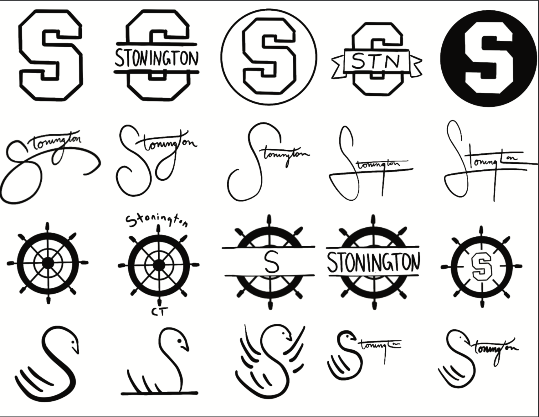
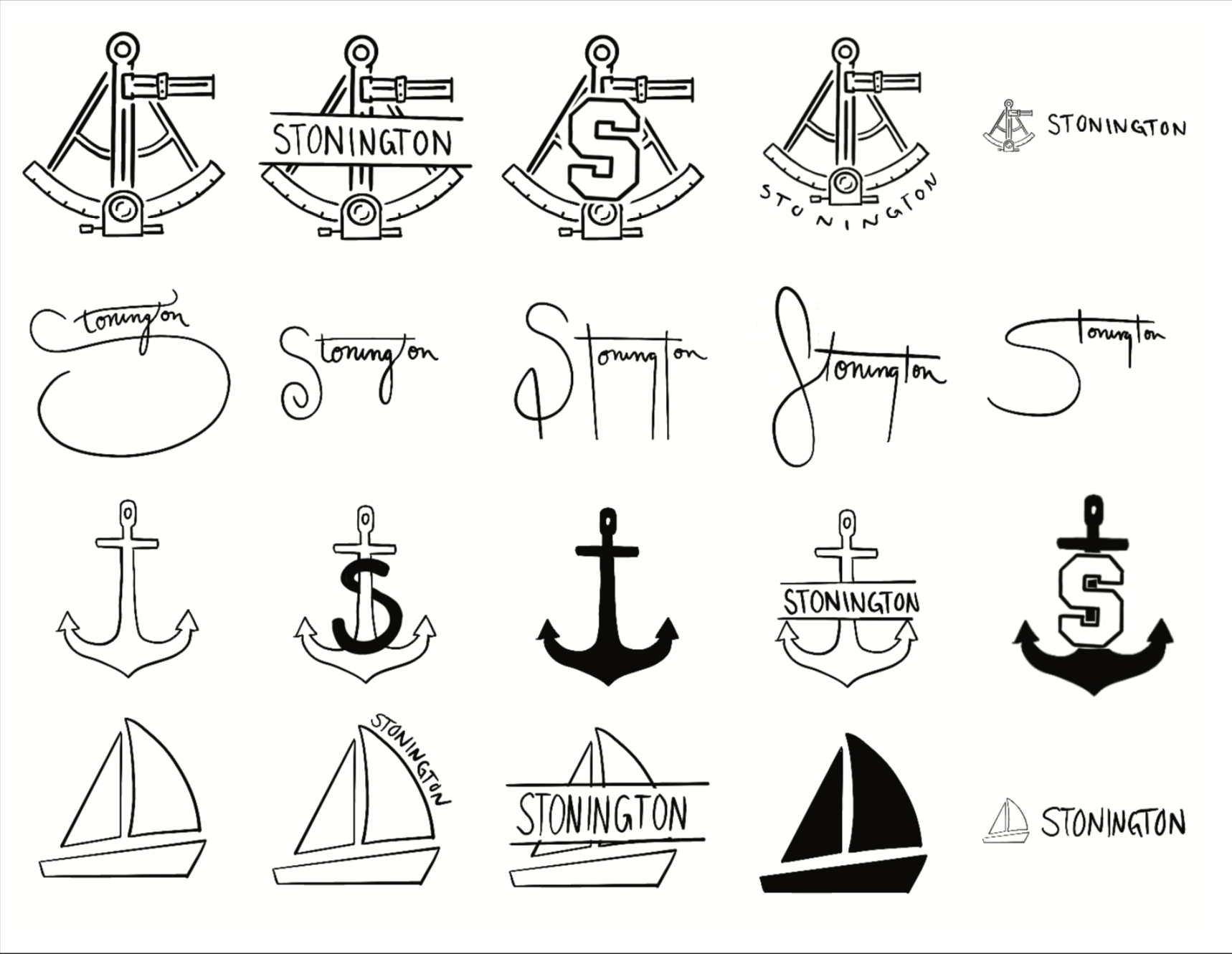
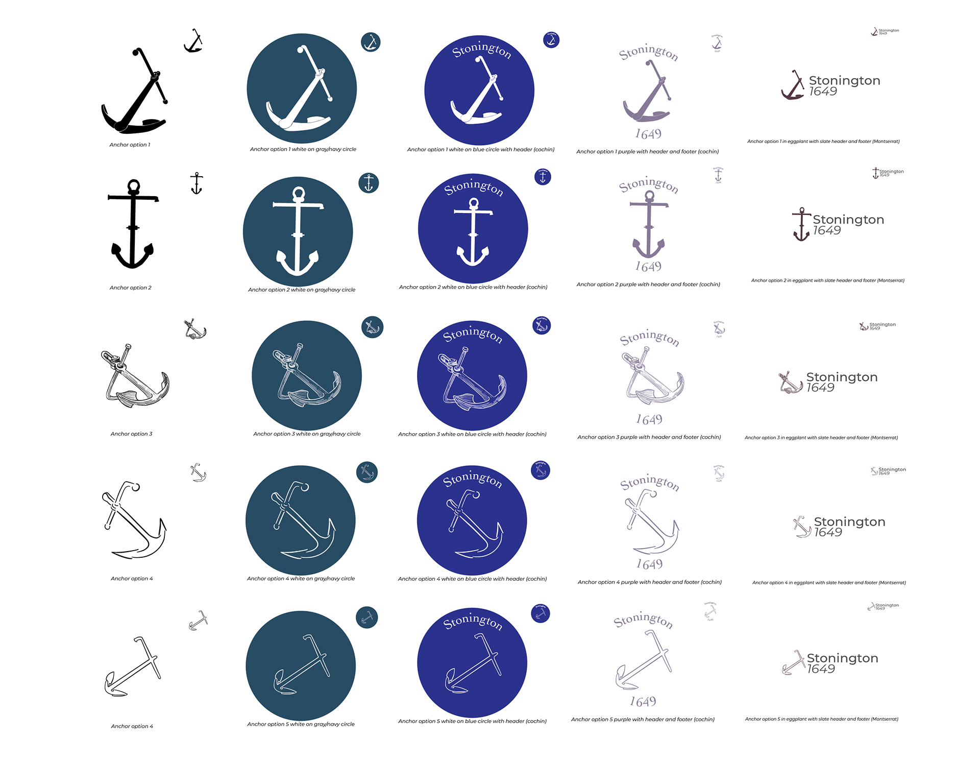
Below, the process of creating this logo started off with a formulaic exploration of 100 visual concepts. Best two of these concepts were further iterated on 25 times each before the final logo was selected and refined.